Work completed for Hamline WRC
Brand Development & Guidelines • Collateral • Logo development • Social Media Identity
Social Media Management • Event Identity • Programming
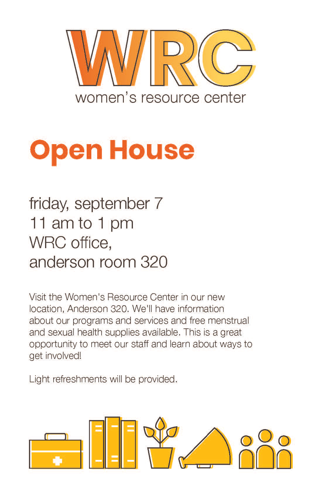
Hamline's Women's Resource Center has been working alongside women and their allies for over 3o years. In Fall of 2018, I was able to give them a brand identity to represent that legacy.
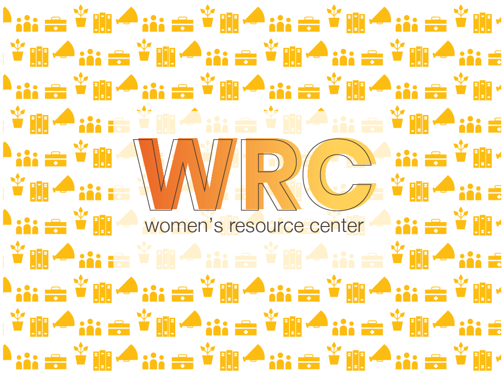
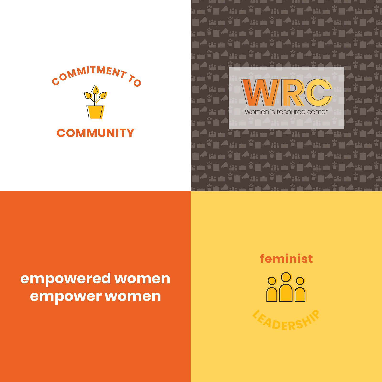
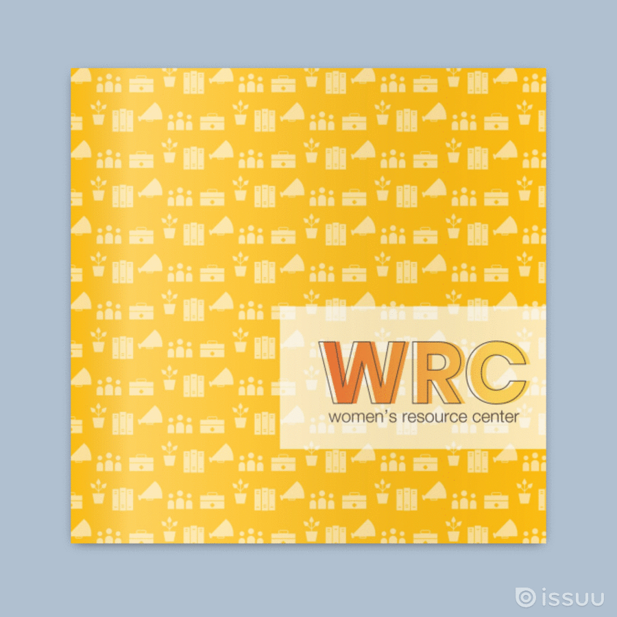
The WRC's logo is bright, energetic, and most importantly, meant to be gender-neutral. The word "woman" encapsulates many different identities, as well as intersectional identities. The colors in the primary logo are from the colors of a sunflower: bright oranges, yellows, and dark brown.
Yellow is the brightest of the visible spectrum, it means happiness, optimism, high energy, and cheerfulness. Orange does a lot of the same, and is often used to call attention. Brown brings a sense of strength and reliability, and earthiness.